
In this post, you’ll learn how to optimize your website to achieve top rankings in mobile search results.
What is Mobile SEO?
Mobile SEO or Mobile Search Engine Optimization is the process of optimizing your website for mobile devices such as smartphones and tablets.
The goal of mobile SEO is to optimize content to offer a great user experience on mobile devices and also make it easier for search engine crawlers to access, index, and rank your content.
Things like making the content adapt to various screen sizes, fast loading of pages, and having font sizes that are readable on mobile are examples of what mobile SEO is all about.
Why is Mobile SEO Important?
Mobile SEO is extremely important for two major reasons:
Mobile-first-indexing – This is a term introduced by Google a few years ago. It means that Google uses the mobile version of the site’s content for indexing and ranking purposes.
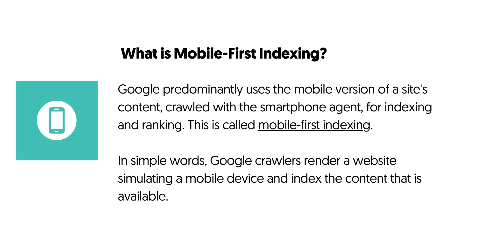
In simple words, Google crawlers render a website simulating a mobile device and index the content that is available.
If you have content on the desktop that is unavailable on mobile, it won’t appear in Google search results.
So, the first takeaway for Mobile SEO optimization is to ensure that your desktop and mobile website have exactly the same content.
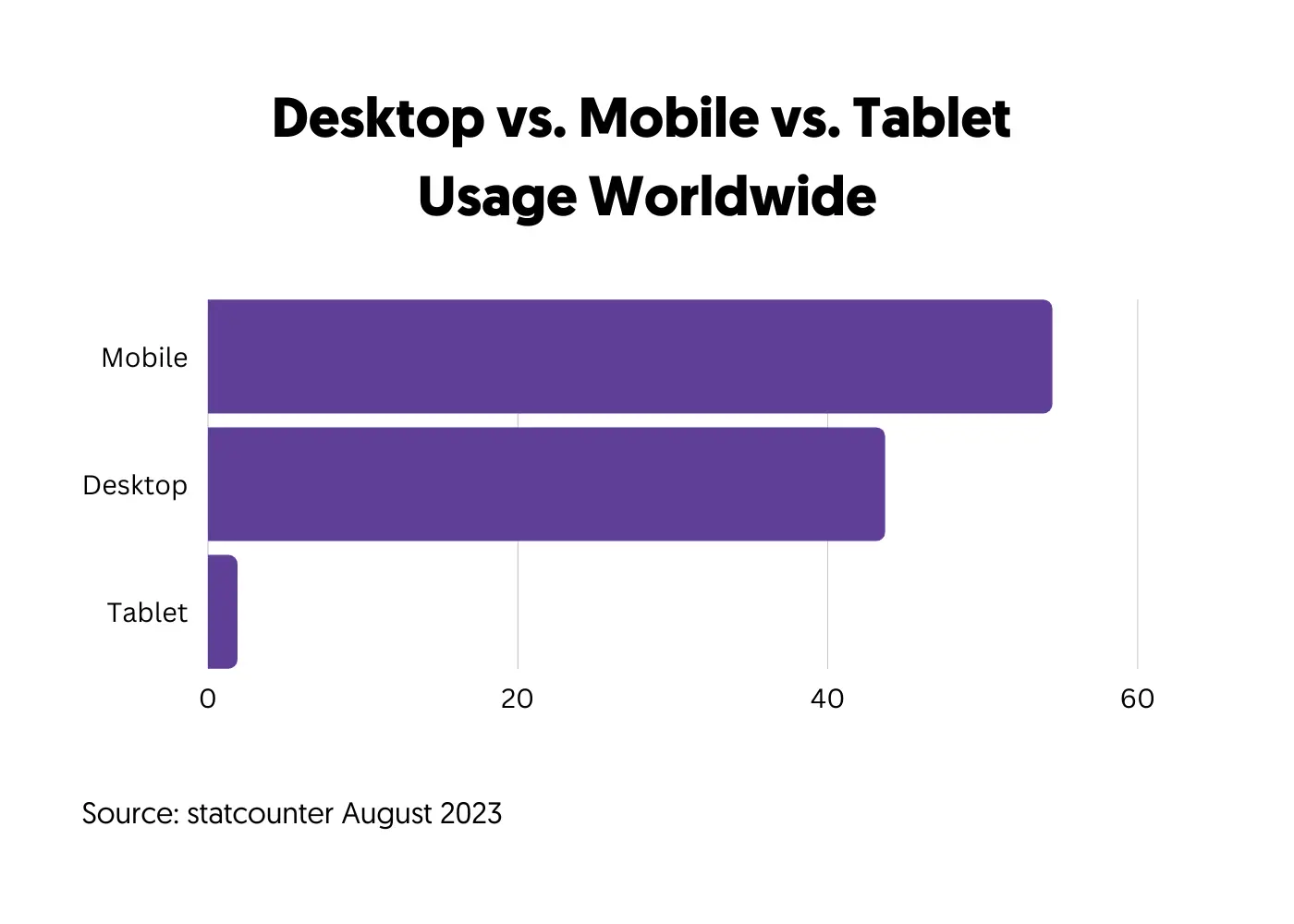
Mobile users are more than desktop – Consistent statistics in the last few years show that mobile usage is more than desktop. The most recent stats give mobile and tablet usage at 56% and desktop at 44%.
If you check your Google Analytics Tech Overview Report (located under USER), you’ll see similar results for your website.
In practice, if you don’t optimize your website for mobile users, your conversions, bounce rate, and other important metrics will be negatively affected.
Even today, a common mistake that many website owners make is to care about how their website and conversion tactics look on desktop, completely ignoring mobile, resulting in fewer conversions and higher CPAs in the case of paid campaigns.
How Does Mobile SEO Differ From Desktop?
Mobile SEO includes ALL SEO rules that apply to desktops, with the addition of some special features applicable to mobile devices only.
When optimizing your website for mobile, you must ensure that buttons and menus are optimized for touch and that critical pages (like a checkout page) are short to avoid too much scrolling.
These are just a few examples. We’ll see below all the elements that need to be optimized for a perfect mobile website.
How to Check if Your Site Is Mobile-Friendly?
Before getting into the Mobile SEO best practices, the first thing to do is check how mobile-friendly your website is.
There are two ways to do this. The first is obviously to check using a mobile device. The problem with this method is that you’ll only test a particular device and screen resolution. Unless you have access to several mobile phones and tablets, this is not the best option.
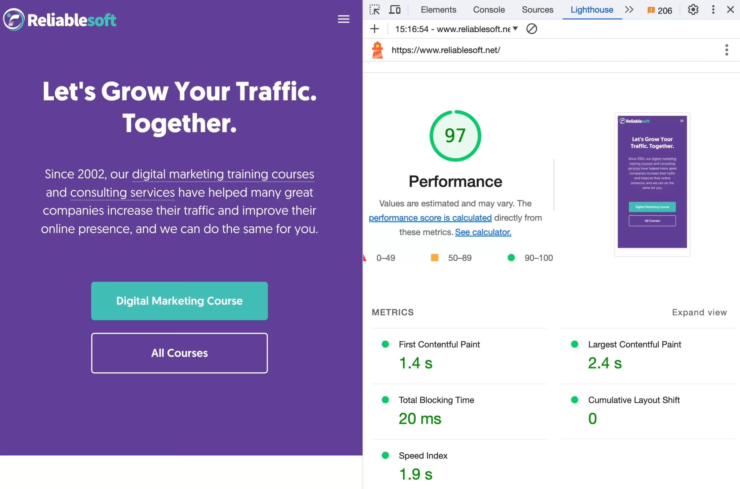
The second option is to test using Lighthouse, a Google tool part of Chrome Developer Tools available in the Google Chrome Browser.
To test your website (or any URL on the web),
- Open Google Chrome,
- Navigate to the website you want to test.
- Right-click anywhere on the page and select “INSPECT” to open Chrome Developer Tools.
- Click the Lighthouse tab.
- In the device, select “Mobile”.
- Click the “Analyze Page Load” button to generate a report.
When you carefully study the report, you’ll see that besides analyzing your page speed in detail, there is a “Mobile Friendly” section with useful advice on improving mobile-friendliness.
Besides the Lighthouse features, you can change the screen width and test all your pages to ensure they look good on different screen sizes.
9 Top Mobile SEO Best Practices
- Adopt a Responsive Web Design
- Format Content For Mobile Devices
- Optimize Page Speed
- Monitor Your Mobile SEO Rankings
- Optimize Content for Mobile SERPs Features
- Do Not Use Full-Screen Popups And Intrusive Interstitials
- Add Structured Data Markup To Your Content
- Optimize Your Website Navigation
- Optimize Landing Pages For Mobile Conversions
1. Adopt a Responsive Design
Adopting a responsive design is the first step in making an optimized mobile website.
With responsive design, your website’s content, images, and other elements adjust seamlessly to fit various screen sizes and resolutions.

This means that whether a user accesses a site from a desktop, tablet, or smartphone, the website will automatically reformat to provide the user with the best viewing experience.
The main benefits of using responsive design are:
- Same content for all – with responsive design, you serve the same content for all users regardless of the device they are using.
- Easy to maintain and update – When making changes, you only need to update content or design on one site rather than multiple versions.
- Google’s preferred method – Google has explicitly mentioned a preference for responsive design due to its user-friendly nature. It simplifies the crawling and indexing process for search engines.
- Save time and money – Eliminates the need to create and maintain separate sites for different devices.
The good news is that most modern CMS (like WordPress, Wix, Squarespace, Shopify, and others) support responsive design natively. This means if you create a website now, you won’t have to worry about mobile design. It is done automatically for you.
But you still have to test how your website looks on mobile using one of the abovementioned methods.
Other non-recommended mobile design options include:
Dynamic Sites – These serve different content (for the same URL) based on the user’s device. While this approach can offer a tailored experience, it can be complex to set up and maintain.
Mobile-Only Websites: These are separate sites created exclusively for mobile users, often hosted on a subdomain (e.g., m.example.com). This approach can be costly and time-consuming, as you’re essentially building and maintaining two separate websites.
If you already have a website that is using one of the non-recommended options above, you should consider switching to a responsive design and take advantage of all the benefits.
2. Format Content For Mobile Devices
The second tip for you is to thoroughly test your website in various resolutions and screen sizes and ensure that users can read the content and scroll through the page without problems.
While this sounds obvious to many webmasters, there are still websites that get this wrong. You may use a responsive design, but:
- If you have to zoom in to read the text,
- If you cannot differentiate the main content of the site from ads
- If the page is full of text and blurry images
- If the buttons are small and difficult to touch
- If the menus are too big and messy for the mobile screen
Then, this is a sign that your content is NOT optimized for mobile despite using a responsive design.
So, to improve your mobile SEO, ensure that:
- Your font size adjusts to different screen resolutions
- Enough white space surrounds your content
- You use enough headings within the text to make skim reading easier
- Text is broken down into small paragraphs
- You use lists to aid readability
- You use high-quality images that look good on mobile
- You utilize special design elements such as accordions to reduce mobile scrolling
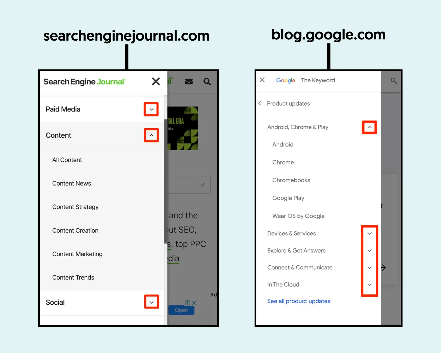
Here are a couple of examples of perfectly optimized mobile sites:
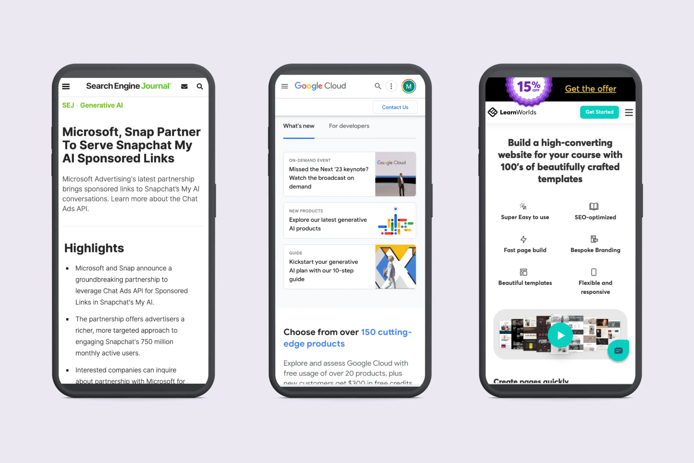
Notice how all the above elements create a great user experience on mobile.
To achieve this without spending too much time or effort, you can adopt a mobile-design first approach.
This means instead of following the traditional way of designing a website, i.e., working on the desktop version first and then adjusting for the mobile, you do the opposite. You design and optimize pages for mobile and then work on the desktop version.
In many cases, this approach will solve many problems and save you time from testing and changing your design to meet mobile needs better.
3. Optimize Page Speed
Page speed is always mentioned as a mobile SEO factor because loading time is more important on mobile than desktop.
Most mobile users access the Internet using their mobile data while on the go. This means that the content should use minimum resources (data) and load as fast as possible, saving them mobile data and time.
This is one of the tasks that you might need the help of a good web developer to optimize your mobile speed to the fullest.
Some actionable tips to consider are:
Use responsive images – this factor can make a huge difference in your loading speed. With responsive images, the website loads smaller size images depending on the screen size.
For example, if you have a 1600px X 1200px image on the desktop, on mobile, it will be cropped automatically to a smaller version (400px X 300px), saving many bytes and improving loading time.
WordPress does this automatically, but this is something you can ask your developer to check and ensure that it works ok.
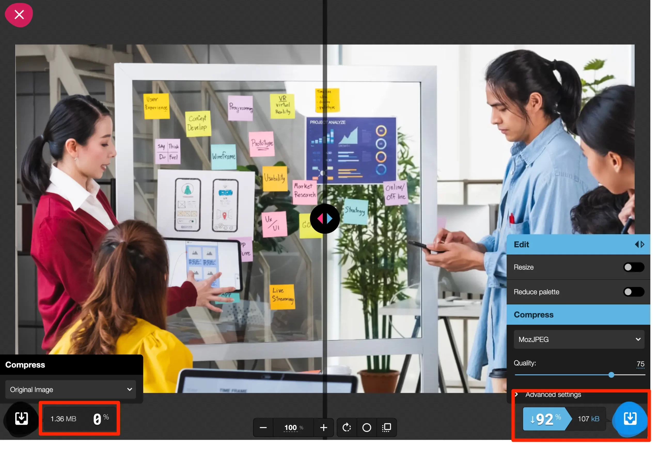
Compress your images and convert them to webp – before uploading images to a page, ensure they are compressed to the maximum.
Even if you use Photoshop, Canva, Pixelmator, or other tools to create your images, they are NOT fully optimized.
Use Squoosh (a free tool by Google) to convert your images to webp format and dramatically improve your loading speed.
See an example below of an image that was originally 1.36MB, and when transformed to webp the size went down to 107KB without affecting the image quality.
Optimize the delivery of videos – If you choose to add videos to your pages to make them more interesting, use the following tips:
- Upload videos to a streaming service such as YouTube or Vimeo and not directly on your website.
- Disable video autoplay. Besides being a bad user experience, it also slows down the loading of a page.
- Use lazy loading to load the videos only when they are in the user’s viewport.
- Replace the video iframe with a preview image.
- Enable caching
- Minify your CSS and JS
- Load any scripts at the footer of the page
The above are the absolute essentials for improving your mobile page speed. Other things to check include preloading and prefetching of resources, moving to a faster server, leveraging browser caching, and many more.
You can read all the details in our comprehensive guide on improving your website’s load time.
As mentioned above, for best results, you should assign this task to a developer. It’s not something that the average webmaster can do.
4. Monitor Your Mobile SEO Rankings
To increase your traffic and rankings on mobile SERPS, you first need to understand how your website performs on mobile.
You can use your Google Search Console reports and an SEO tool to analyze your mobile rankings.
Check your mobile rankings using Google Search Console
- Go to GSC and click SEARCH RESULTS, located under PERFORMANCE.
- Click the + NEW button and select DEVICE.
- Choose MOBILE and click APPLY.
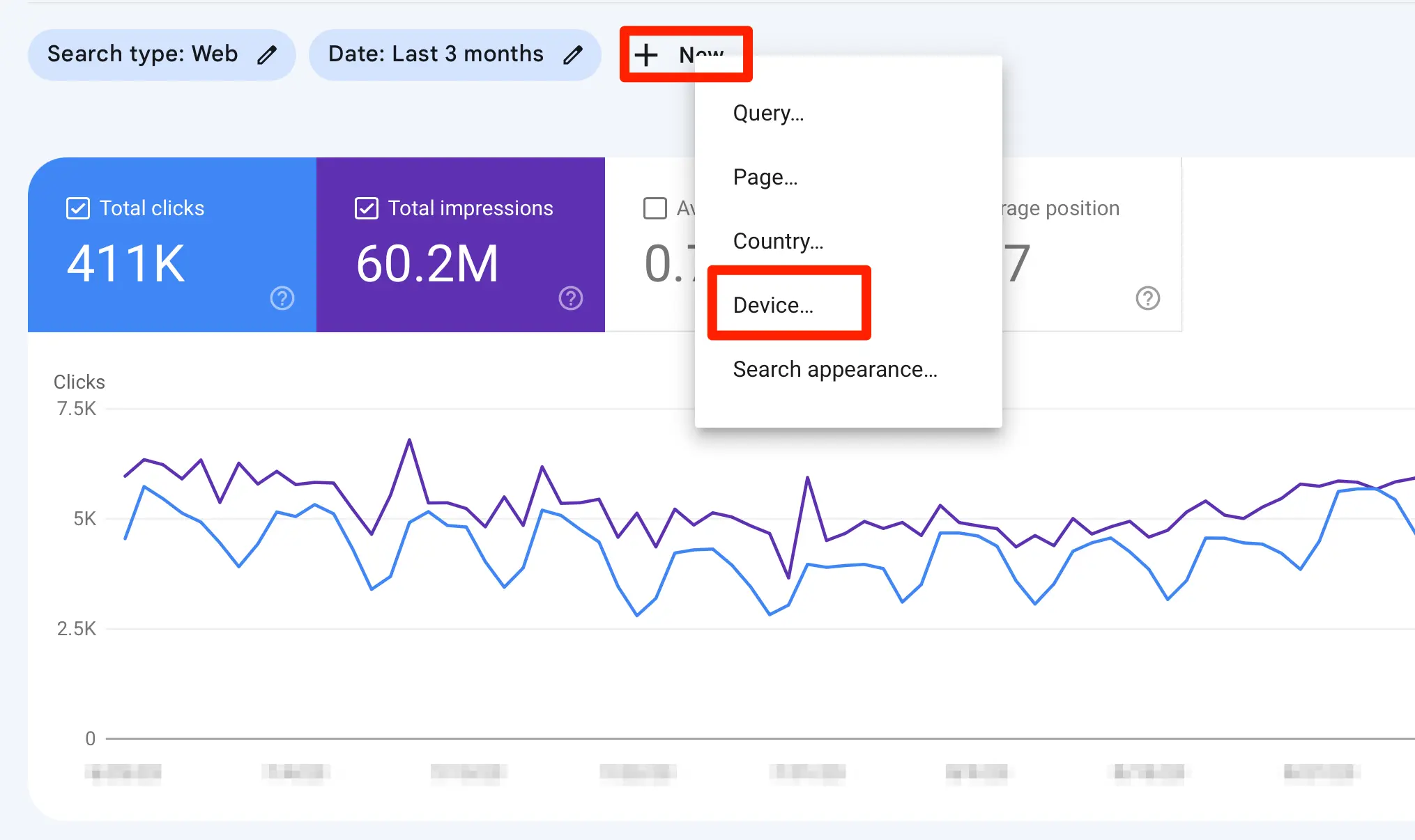
The report now shows for which mobile queries your website appeared on Google. You can use the different tabs to see your popular pages, compare different time periods, and extract a lot of useful data for your analysis.
It’s important to do this BEFORE starting SEO mobile optimization so that you can compare the results after making changes.
Check your mobile rankings using an SEO Tool
Another way to check your mobile ranking is by using a tool like Semrush, Ahrefs, Moz, Ubersuggest, or others.
In Semrush, all you have to do is enter your domain in the Organic Research report and select MOBILE from the DEVICE dropdown.
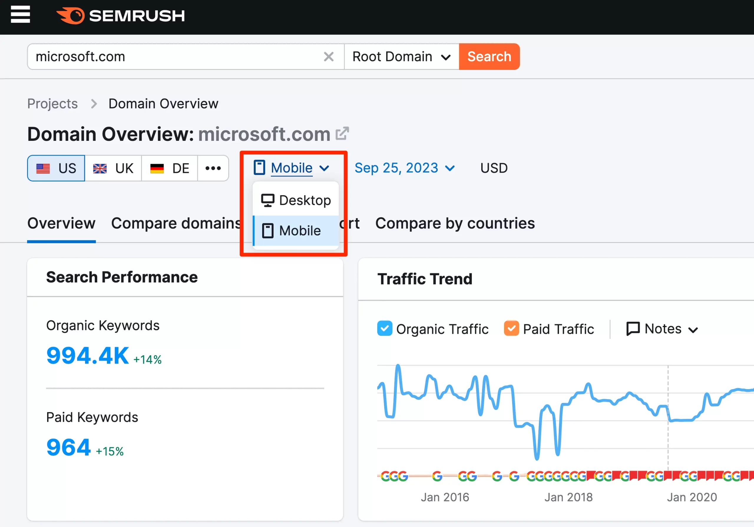
You can then do further analysis by reviewing the various reports and filter options.
What you’ll probably notice is that the results will be slightly different from the desktop. On mobile, you’ll most likely rank for local searches, even if you don’t explicitly optimize your pages for those terms.
Don’t worry if this is too much information to consume. What is important at this stage is to know how to monitor your Mobile SEO rankings and understand how they differ from desktops.
5. Optimize Content for Mobile SERPs Features
When searching on Google via a mobile device, the results often include unique features tailored to the mobile experience.
These SERP (Search Engine Results Page) features are designed to provide users with the most relevant information quickly and in a format that’s easy to digest on smaller screens.
Let’s see a couple of examples of how you can improve your website presence:
Mobile Results Are More Visual – Google uses images on many occasions to make the mobile SERPS visually attractive.
Optimization Tip 1: Use high-quality featured images with optimized image alt text, filenames, and surrounding content to increase the chances of your images appearing in the SERPS.
Optimization Tip 2: Set The max-image-preview:large meta tag. The max-image-preview is a directive instructing search engines to show large image previews of an image in Google search results and other Google products. Definitely talk to your developer about this.
Your Snippets on Mobile – Google may show your meta description or other content from your webpage in your snippet. Create concise meta descriptions and ensure that the first few lines of your content are engaging and relevant.
Appearing in Local Packs for Location-Based Queries – Ensure your business is listed on Google My Business, gather positive reviews, and maintain consistent NAP (Name, Address, Phone Number) across all online listings.
Featured Snippets, Google Seach Generative Experience (GSGE), and Knowledge Panels – Ensure your content is structured and authoritative. Using structured data markup can help highlight key information for Google.
People Also Ask, More to Ask – this section is shown on top of the results, showing related queries and questions to users. Structure your content with clear subheadings and Q&A formats. Research commonly asked questions in your niche and address them in your content.
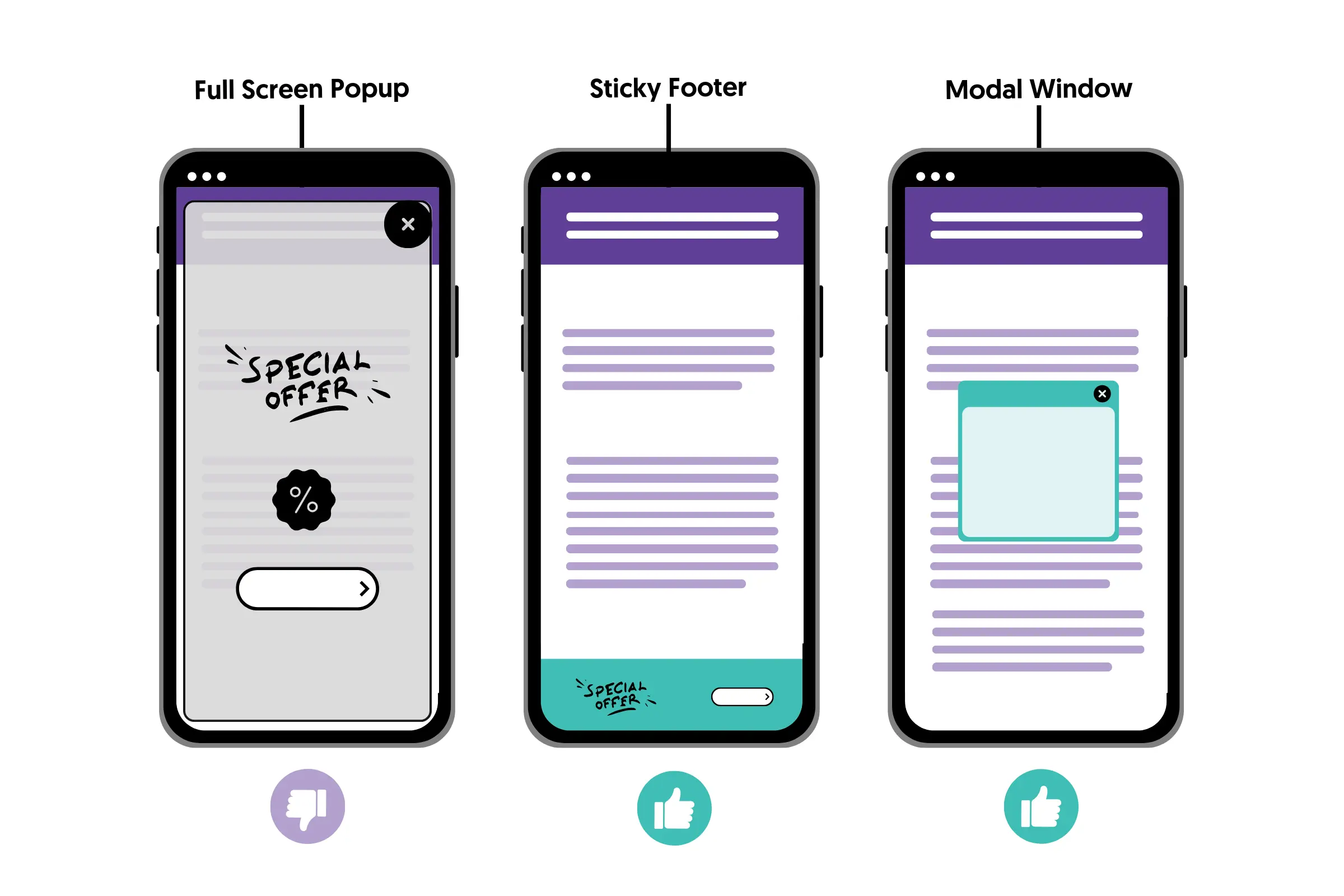
6. Do Not Use Full-Screen Popups And Intrusive Interstitials
Google has very strict rules regarding using full-screen popups and intrusive interstitials on mobile.
What you shouldn’t do:
- Do not use popups that cover the whole screen, even if you add a close button.
- Do not use popups that load as soon as the page loads
What you can do:
- Use sticky footer banners
- Use modal windows
- Use small banners that cover only a part of the screen
- Show your banners or popups after users spend a considerable time on your website, not on page load.
For more information, read the Google guidelines and examples.
7. Add Structured Data Markup To Your Content
Having structured data on your content is not only great practice for Mobile SEO, but it also makes your content search engine friendlier.
In simple terms, structured data is a formal way to describe parts of your content to search engines.
This can potentially lead to richer search results and improved click-through rates.
For example, there is structured data to use on your breadcrumb menus, product pages, images, videos, and contact pages, to name a few.
Here is an example of how structured data code looks:
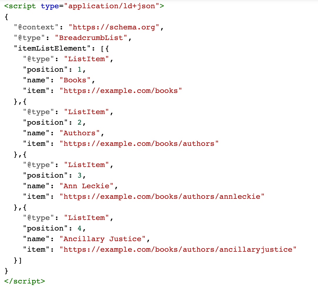
You can see a full list of the structured data types supported by Google here.
To learn how to add structured data to your site, read our in-depth guide on Schema Markup (which is a different name for structured data).
Keep in mind that this is another technical task that you might need the help of a web developer to implement correctly.
8. Optimize Your Website Navigation
One of the elements that need special attention on mobile devices compared to desktops is your menu.
On your desktop version, you can have a big menu with different levels because the screen width and height are bigger, but that’s not the case on mobile.
When designing your mobile menu, keep the following best practices in mind:
Keep it simple and short – If you have a big menu on the desktop site with many options and levels, consider creating a simpler and shorter menu for mobile users.
A hard-to-navigate menu will be bad for the user experience, while a shorter and simpler mobile menu will help mobile users find what they are looking for.
List the most important options first – Optimize your menu by prioritizing the pages that your users are most likely to visit first.
Use click tracking, heatmaps, or session recording software to determine which menu options get the most clicks and change the order based on data.
Use collapsible menus to avoid too much scrolling – another clever technique is to use collapsible menus to group related options together. This way, you can show users more options but in a mobile-friendly way.
Use a large font – use a large-size font that is readable without zooming in. This is very important for menu items, and despite being very easy to implement, there are still sites today that get this wrong.
Design for touch – Make sure that all links, buttons, arrows, phone numbers, and any other elements are designed for touch. This might mean making them bigger and more accessible.
Use the right contrast ratio – Don’t assume that everyone has the same vision. Some color combinations of background and text color are difficult to read for some people, especially on mobile screens.
This is related to contrast radio. In general, similar colors have a low contrast ratio while different colors have higher.
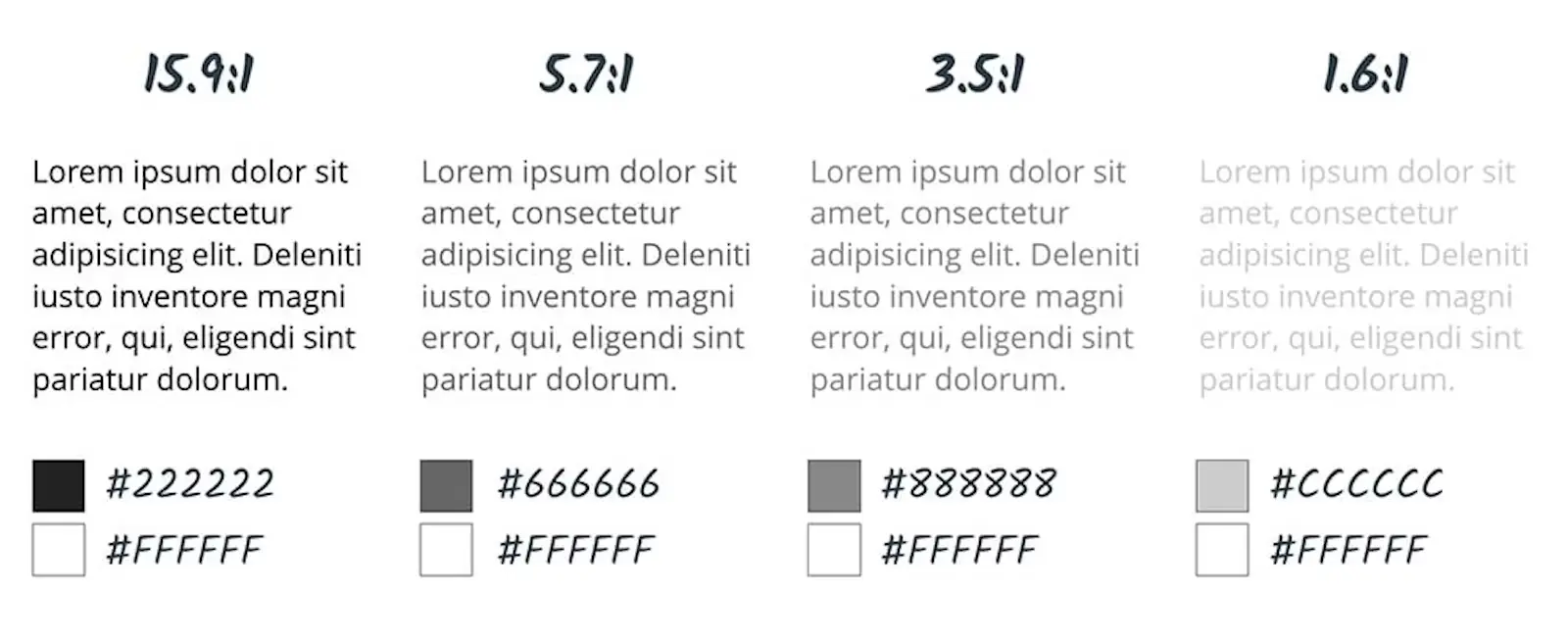
Take a look at the guidelines on the best contrast ratio to use and how to check your current contrast ratio.
Test on different sizes and resolutions – Lastly, ensure that you test how your menu looks and functions on different sizes and resolutions using Google Chrome Developer Tools.
Testing on your mobile only (something that most people do) is a very bad practice.
9. Optimize Landing Pages For Mobile Conversions
Another mistake that we often see is website owners spending all their time optimizing their landing pages for desktop users without even testing on mobile.
This is a huge mistake, especially if you expect traffic and conversions from social media platforms, which is 95%+ mobile.
Optimizing your landing pages for mobile conversations is not difficult. All you have to do is follow all the Mobile SEO best practices analyzed in this post, with the addition of:
Eliminate destructions – Remove any non-essential images, menus, or other elements that divert the user’s attention from the primary goal of your landing page.
Keep CTA buttons visible as users scroll through the page – Mobile users tend to scroll quickly. If your CTA isn’t immediately visible, they might miss it.
Use sticky CTAs that remain at the bottom or top of the screen as users scroll, ensuring they always have an opportunity to convert.
Use accordions to save space – Accordions allow you to “hide” content, showing only headings that can be expanded when clicked.
You can use accordions for FAQs, product details, or any other information that is not vital for users to know before converting.
Shorten your copy to avoid too much scrolling – Prioritize the most crucial information at the beginning of the page. Use bullet points and short paragraphs (with accordions) to make content more digestible.
Use a streamlined checkout process – Minimize the number of steps in the checkout process. Use auto-fill where possible, offer multiple payment options, and ensure the process is as smooth and quick as possible.
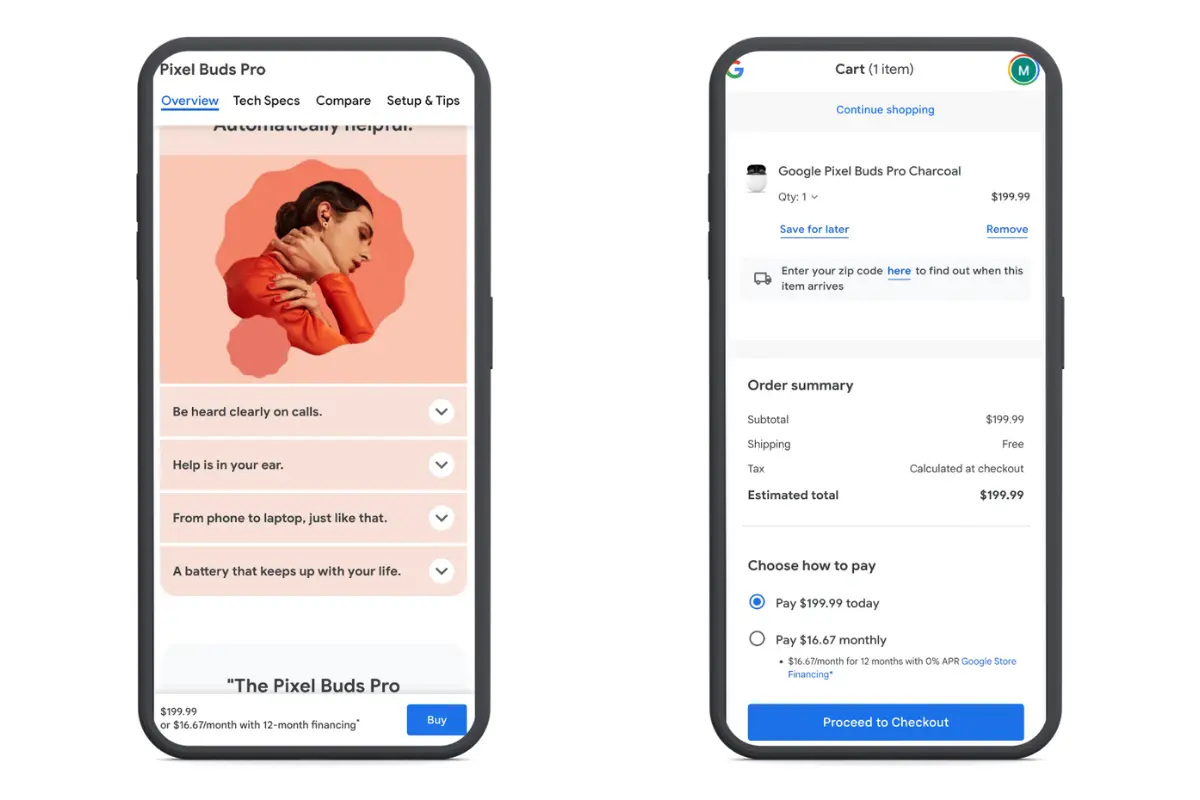
Here is a good example of an optimized mobile landing page from the Google Store:
Our post on the best landing page examples includes more examples of landing pages that provide a fantastic experience for mobile users.
Conclusion
Mobile SEO is not difficult to implement, but it’s necessary if you want to increase your Google rankings and reach millions of users using smartphones and tablets.
For best results, ensure that your content is the same on desktop and mobile and that you use a responsive design so that every SEO change you make will apply to both.
Besides that, pay special attention to how your content, landing pages, menu, and other elements look on mobile devices.
Do thorough testing to identify problems and elements that can be improved and ensure that users’ experience on mobile is the best possible.

